


An analyst one sunny morning was searching for something in front of his house. A passer-by asked him what he was doing. ‘Looking for my watch,’ he said. After some time looking around, the perplexed onlooker asked him if he was sure that he lost it there, to which the analyst replied “No I lost it in my shed, but it’s too dark in there to find it.’
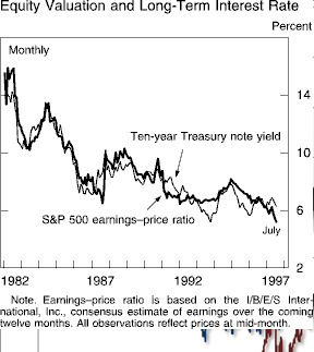
When you ask an equity salesman whether stocks are “cheap”, the answer follows without hesitation (and it’s always in the affirmative). The most popular justification over the last 20 years has been that shares are “cheap” relative to bonds, and they often point to the Fed Model to emphasise this point. As the chart below shows, the track record between 1980 and 2000 has been impressive.
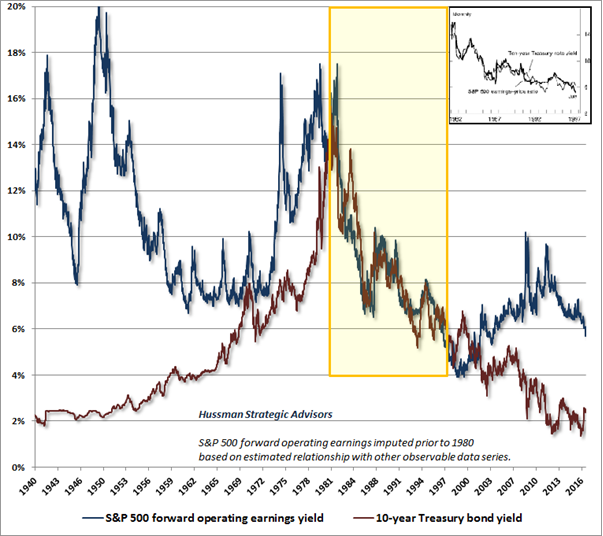
But what analysts/salesmen etc. rarely point out is that they are, to put it politely, carefully selecting their timescale. Below gives us the picture since the 1940’s (from Hussman funds), and that reveals a vastly different picture. There appears to be no sustainable relationship between the two metrics, and such as it was, the correlation appears to have broken down since the 2000 market top.
Why might this theory not hold water- 3 things immediately jump to mind, though there are other reasons for caution.
(For a more scholarly approach to the problems inherent in the Fed Model please see here).
1) The two competing assets do not measure the same thing; we have two separate assets, focussing on diametrically opposite things (Growth and Inflation), giving us an extremely tight correlation despite one (equities) having 8x more Interest rate exposure than the other. The bond market has a Duration of around 6 years at present (as per the Vanguard Total Bond Market ETF), whilst the S&P 500 has a duration (which can be approximated by the Price/Dividend ratio) of 50 [1]. To see how unrealistic this is, imagine an 8-year bond providing a similar expected return to that of a one-year equivalent. For 8 times the risk, one might assume a similarly elevated relative return! The Equity Risk Premium (ERP) allows for this, but the Model is silent on the issue, assuming as it does, that the returns should be equal. As a result, the model fails to tell us whether stocks are cheap, or bonds are expensive (and it could be either or both!).
2) The Earnings Yield (which is the inverse of the Price/Earnings ratio takes no account of profit margins. When margins are at highs (as they are now), earnings will be flattered, and thus earnings yields will look unsustainably large. (Conversely, P/E ratios will look smaller than they would be over the long term). One year’s earnings will thus not be a sufficient statistic on which to base the long-term stream of cash flows that a Firm will generate over its lifetime. Market Competition will almost certainly ensure that profit margins will mean-revert over time, so one needs to base valuations on a number of years, rather than the latest iteration of earnings. Companies have an almost infinite life, so, as for example the CAPE (Cyclically Adjusted Price Earnings) measure tries to do, one needs a much better picture of long-term earnings power, than Wall Street’s estimates of next year’s profits provides. In addition, the Earnings Yield does not reflect that which the shareholder actually receives, since it ignores the reinvestment back into the business that is vital to sustain long-term growth. (In contrast, once one knows the yield of a bond, one knows exactly what one will get on maturity, subject, of course, to the firm remaining solvent).
3)There is thus no obvious reason why a one-for-one relationship should hold for any significant length of time. In fact, the correlation looks a spurious one (like this, though not as amusing). In fact, it may simply be a function of coincidence. 1982 signaled the end of the Volcker squeeze on inflation which had been stubbornly high throughout the 1970’s and which ended in 1982 AND the end of what had been a secular decline in equity prices over the same period. By 1982, the S&P 500 had fallen over 60% from its 1960’s highs and was trading at a P/E ratio of just 7.5 x trailing earnings (compared to 26.5x now). Thus, the stage was set for a strong market in both assets independently, regardless of what the Fed Model foretold.
The moral of the story is that before “investing” in via theory of how anything works, be sure to look under the bonnet and see if there is more to the story than we are being told. Sometimes, markets get convinced even by the flimsiest of evidence, merely demonstrating the truth of Keynes’ axiom that they can remain irrational longer than skeptics can remain solvent. 20 years seems a long time, but the longer term picture is far less convincing (and more relevant), but you can be sure “experts” will not tell you this, (if it undermines their investment pitch). No theory works perfectly for any significant period (since if everyone acted on the same basis, there would be no-one left to push the asset price higher, leading to bubbles and crashes as everyone then tried to flee).
This is why we used 60 + year data to construct portfolios, far beyond their actual lifespan. We go back as far as we can to ensure that what we see now is what we can be reasonably certain will pertain in the future, all things equal. It is also why we don’t try to “time” markets.
[1]] The Index price (2383) divided by $47.66, (the dividends paid out by the Index constituents), gives a ratio of 50. For comparison, the FTSE 100 has a duration of 26.3x (7345/279.1).
